Version 0.6.2 ( master branch )
This package provides a ggplot2 implementation of the
biplot, a simultaneous plot of scores for observations and vectors for
variables for principal component-like analyses.
The package provides two main functions: ggscreeplot() and
ggbiplot().
ggbiplot aims to be a drop-in replacement for the
standard R function stats::biplot() with extended
functionality for labeling groups, drawing a correlation circle, and
adding data ellipsoids. It also supports PCA-like objects calculated by
FactoMineR::PCA(), ade4::dudi.pca() and
MASS::lda().
The package was originally developed by Vince Vu at https://github.com/vqv/ggbiplot. That development was supported in part by NSF Postdoctoral Fellowship DMS-0903120 from 2009-2012. The current version, now on CRAN, will be the locus of further development.
You can install the latest CRAN version, or install from GitHub as shown below.
| CRAN version | install.packages("ggbiplot") |
GitHub master |
remotes::install_github("friendly/ggbiplot") |
Load packages:
library(ggplot2)
library(ggbiplot)
library(dplyr)
library(corrplot)

# set ggplot2 theme
theme_set(theme_minimal(base_size = 14))The crime data gives rates of various serious crimes in
each of the 50 U. S. states, originally from the United States
Statistical Abstracts (1970).
Let’s take a quick look at the correlations among these, using
corrplot::corrplot() and showing each correlation by an
ellipse whose eccentricity and shading represents the value of the
correlation.
data(crime)
crime |>
  dplyr::select(where(is.numeric)) |>
  cor() |>
  corrplot(method = "ellipse", tl.srt = 0)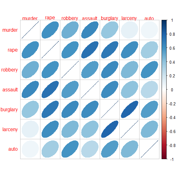
The correlations are all positive. Note also that the variables in the dataset are ordered in seriousness or violence, ranging from murder to auto theft.
Carry out a PCA:
crime.pca <-
  crime |>
  dplyr::select(where(is.numeric)) |>
  prcomp(scale. = TRUE)

crime.pca
#> Standard deviations (1, .., p=7):
#> [1] 2.029 1.113 0.852 0.563 0.508 0.471 0.352
#>
#> Rotation (n x k) = (7 x 7):
#>             PC1     PC2     PC3     PC4     PC5     PC6     PC7
#> murder   -0.300 -0.6292 -0.1782  0.2321  0.5381  0.2591  0.2676
#> rape     -0.432 -0.1694  0.2442 -0.0622  0.1885 -0.7733 -0.2965
#> robbery  -0.397  0.0422 -0.4959  0.5580 -0.5200 -0.1144 -0.0039
#> assault  -0.397 -0.3435  0.0695 -0.6298 -0.5067  0.1724  0.1917
#> burglary -0.440  0.2033  0.2099  0.0576  0.1010  0.5360 -0.6481
#> larceny  -0.357  0.4023  0.5392  0.2349  0.0301  0.0394  0.6017
#> auto     -0.295  0.5024 -0.5684 -0.4192  0.3698 -0.0573  0.1470
The biplot, using default scaling (standardized components), and labeling the states by their state abbreviation:
ggbiplot(crime.pca,
         labels = crime$st ,
         circle = TRUE,
         varname.size = 4,
varname.color = "red") 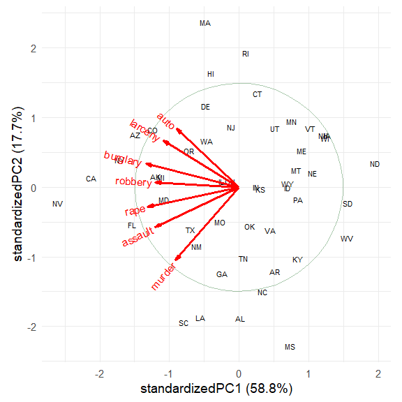
The directions of the principal components are arbitrary; we are free
to reflect the variable vectors and component scores to facilitate
interpretation. Also, there seem to be differences among regions of the
U.S., which can be visualized using data ellipses for the component
scores. The groups argument allows the observations to
colored by group and to summarized by groups.
crime.pca <- reflect(crime.pca)
ggbiplot(crime.pca,
         groups = crime$region,
         labels = crime$st,
         labels.size = 4,
         var.factor = 1.4,
         ellipse = TRUE, ellipse.level = 0.5, ellipse.alpha = 0.1,
         circle = TRUE,
         varname.size = 4,
         varname.color = "black") +
  labs(fill = "Region", color = "Region") +
  theme(legend.direction = 'horizontal', legend.position = 'top')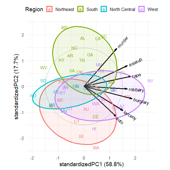
The interpretation of the data is now clear.
The first dimension, accounting for 58.8% of variance, can be seen to represent overall crime rate, with Nevada (NV) at the high end and North Dakota (ND), South Dakota (SD) and West Virginia (WV) at the low end.
The second dimension, accounting for 17.7% of variance represents a contrast between personal crime vs. property crime. On this dimension, Massachusetts (MA), Rhode Island (RI) are opposed to Mississippi (MS), Alabama (AL), Louisiana (LA) and South Carolina (SC).
The regions are represented by the differences in the centers of the data ellipses for the scores. Southern states are highest on murder, assault and rape, while the Northeast states are highest on auto theft and larceny.
In this standardized view, the angles between variable vectors
approximate the correlations among the variables, according to \(\cos (\text{angle}) \approx r\). Thus,
murder and auto, nearly \(90^o\) reflect a near 0
correlation.
The wine data contains results of a chemical analysis of
wines grown in the same region in Italy, derived from three different
cultivars. The analysis determined the quantities of 13 chemical
constituents found in each of the three types of wines. The grape
varieties (cultivars), barolo,
barbera, and grignolino, are given in
wine.class.
What can we understand about the differences among these wines from a biplot?
data(wine)
wine.pca <- prcomp(wine, scale. = TRUE)
ggscreeplot(wine.pca) 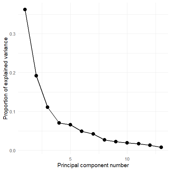
Hmm. The screeplot shows that more than two dimensions are necessary to account for most of the variance.
Plot the first two PCA dimensions, accounting for 55% of the variance.
ggbiplot(wine.pca,
  obs.scale = 1, var.scale = 1,
  groups = wine.class,
  varname.size = 4,
  ellipse = TRUE,
  circle = TRUE) +
  labs(fill = "Cultivar", color = "Cultivar") +
  theme(legend.direction = 'horizontal', legend.position = 'top')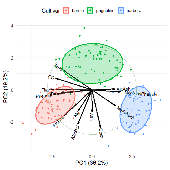
The three cultivars are arranged along the first dimension, in the
order barolo < grignolino < barbera. These are distinguished
largely by a contrast between (Phenols, Flav)
vs. (NonFlavPhenols, AlcAsh). The second
dimension is represented by the cluster of variables Mg,
Alcohol, Ash, Color, which
distinguishes grignolino from the other two.
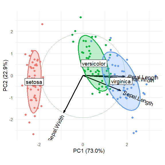
The classic iris data is widely used for examples of multivariate analysis and biplots, so let’s use it here.
data(iris)
iris.pca <- prcomp (~ Sepal.Length + Sepal.Width + Petal.Length + Petal.Width,
                    data=iris,
                    scale. = TRUE)
summary(iris.pca)
#> Importance of components:
#>                         PC1   PC2    PC3     PC4
#> Standard deviation     1.71 0.956 0.3831 0.14393
#> Proportion of Variance 0.73 0.229 0.0367 0.00518
#> Cumulative Proportion  0.73 0.958 0.9948 1.00000
Plot the first two dimensions:
iris.gg <-
ggbiplot(iris.pca, obs.scale = 1, var.scale = 1,
         groups = iris$Species, point.size=2,
         varname.size = 5,
         varname.color = "black",
         varname.adjust = 1.2,
         ellipse = TRUE,
         circle = TRUE) +
  labs(fill = "Species", color = "Species") +
  theme_minimal(base_size = 14) +
  theme(legend.direction = 'horizontal', legend.position = 'top')

iris.gg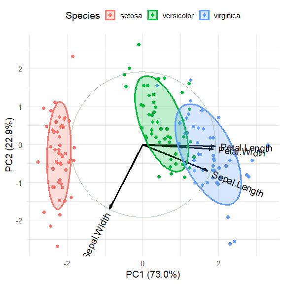
It is possible to add annotations to the biplot by making use of the
fact that ggplot() returns a lot of information in the
"gg" object. In particular, the $data
component contains the scores on the principal components that are
plotted as points here. Here we add direct labels for the groups and
suppress the legend.
# get means of coordinates by group
group.labs <-
  iris.gg$data |>
  summarise(xvar = mean(xvar),
            yvar = mean(yvar), .by = groups)

group.labs
#>       groups   xvar   yvar
#> 1     setosa -2.217 -0.288
#> 2 versicolor  0.495  0.548
#> 3  virginica  1.723 -0.260
Now, just use geom_label to draw labels for the
groups.
iris.gg + geom_label(data = group.labs,
                     aes(x = xvar, y=yvar, label=groups),
                     size = 5) +
  theme(legend.position = "none")